
Every year, the ABS puts out an analysis of mortality statistics for the calendar year, imaginatively entitled Deaths. And most years I post a quick analysis. The most recent one is based on mortality statistics for the calendar year 2012.
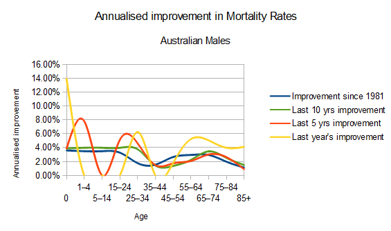
This year I’ve focused on mortality improvement, and what has been happening over the past generation. The first graph I’ve shown is a little busy, but broadly what it shows is that the biggest improvement in male mortality rates has been at younger ages. From newborns until around the age of 20, mortality rates have improved every year, for the last 30, by just under 4% pa. For those in their working ages, mortality rates have not improved as much. They’ve improved by around 2% pa (which is still pretty good), but peak working years are the lowest rates of improvement in Australia.
Once you get beyond retirement age, your mortality rates improve again – over the last 30 years, mortality rates have improved more at older ages than they have at peak working ages for men.
Not surprisingly, a one year improvement is much more volatile than an average over 30 years, with last year’s improvement.
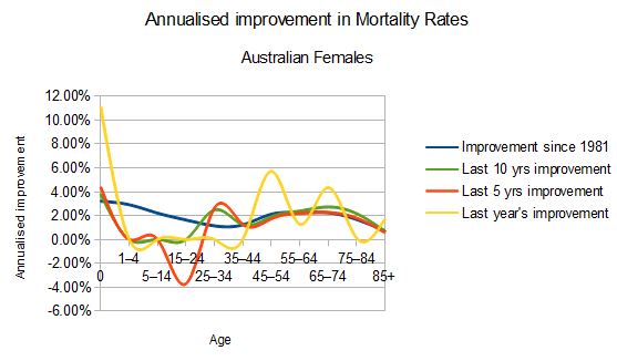
I’ve also shown the female graph, which has a bit more volatility particularly at younger ages. Over the past 30 years, it also shows improvement for all ages, with a bit of a dip at working ages.
For women in particular, recent mortality improvements have really dropped off at the younger ages. My theory is that for men, a lot of serious work has gone into reducing deaths from various violent causes, such as accident, murder, suicide etc (famously known as the accident hump in the mortality curve). Women were not as likely to die from these causes to start with, so there wasn’t as much improvement that could be made.
So, with the Australian Life insurance industry becoming less and less profitable, do mortality improvements (or their lack) have any influence? I suspect that there are some companies that have banked on continuing mortality improvements in setting premium rates, and the main insured age group has not improved as much as the population as a whole. But it is unlikely to be a big influence on profitability, as improvements have continued right across the age curve.
Surprisingly (to me at least) the biggest improvement continues to be in mortality rates for newborns; it is great to see that the mortality rate for a newborn (male or female) in their first year is now under 4 per 1,000 in Australia. That is one of the best rates in the world, and only 10% of the average mortality rate for all babies in the world in their first year of life. Check out this interactive graph of Australian life expectancy and infant mortality rates over the last 200 years (from my favourite demographers at Gapminder).