
Insight
Recent antibody testing in New York has added weight to my hypothesis that the infection fatality rate of Covid19 is around 1%.
New York has done some random-ish population testing of antibodies to the Sars-Cov2. This New York Times article has the story.
In New York City, about 21 percent tested positive for coronavirus antibodies during the state survey. The rate was about 17 percent on Long Island, nearly 12 percent in Westchester and Rockland Counties and less than 4 percent in the rest of the state.
State researchers sampled blood from the approximately 3,000 people they had tested over two days, including about 1,300 in New York City, at grocery and big-box stores. The results were sent to the state’s Wadsworth facility in Albany, a respected public health lab.
Using that result, I’ve calculated an infection fatality rate (the rate of death if you become infected) of around 1.1%. This is very similar to the Diamond Princess death rate (8 from 634 positive tests or 1.3% from an older population) and the calculation we did for the Actuaries Institute using Imperial College mortality rates on the Australian population, also of 1.1%.
How did I get to that calculation?
The population of New York City is approximately 8.4 million. That would suggest 1.76 million New Yorkers have had Covid19. The reported deaths in New York City have been 15,411 (including probable cases, to 22 April 2020). But, in common with many other places overwhelmed by Covid19, not all deaths have been counted. This NY Times article suggests that the total likely Covid19 deaths in NYC to 22 April were 19,200 (the total deaths reported, less the average deaths during the first four months of the year). If you take 19,200 deaths, from 1.76 million New Yorkers, that’s an infection fatality rate (IFR) of 1.1% – ie 1.1% of those infected have died. This twitter thread reaches a similar conclusion, and gives some flavour of the level of randomness of the study. [Readers paying close attention will note that testing people at grocery and big-box stores will over emphasise people of working age – older people are more likely to have someone shopping for them, whether commercially, or a neighbour, and younger people are not likely to be grocery shopping].
In contrast, in Santa Clara county in California, a much smaller study, which has had quite a bit of criticism, suggests a lower death rate, between 0.3% and 0.5%. I’m not giving that study much weight, so I’m increasingly of the view that assuming 1% deaths of those infected is an adequate estimate (given all the uncertainty) to make good decisions around risks and rewards.
Link
I’ve posted about this link between issues before, but here is fascinating evidence of the strong overlap between climate science deniers and Covid19 deniers and/or people arguing to remove all social distancing restrictions.
In the following series, DeSmog presents the #COVIDenial evidence our team has gathered revealing the overlapping cast of characters who have long attacked climate science and are now spreading COVID misinformation, touting false cures, ginning up conspiracy theories and fomenting attacks on public health experts. We began tracking this overlap in March 2020, when Sharon Kelly wrote Meet the Climate Science Deniers Who Downplayed COVID-19 Risks.
Many of these groups, including Koch network-funded entities such as Americans for Prosperity and State Policy Network members have also attacked stay-at-home orders and orchestrated ‘Liberate’ movement protests nationwide, as Steve Horn wrote in COVID-19 ‘Liberate’ Groups Are the Same Ones Pushing Climate Denial.
While superficially science denial seems a logical link, there must be some more economic links to it to make such a strong overlap make sense.
Life Glimpses
In this household, we haven’t had a car for 10 years. When we need one, we use a car sharing scheme. In all that time it’s worked really well – we’ve only once or twice failed to find a car nearby when we needed one, and it has been a great economic decision, with the bonus, that at the margin, we get more exercise. But now that we are trying to avoid potential contamination, a car sharing scheme is not really a great alternative to public transport.
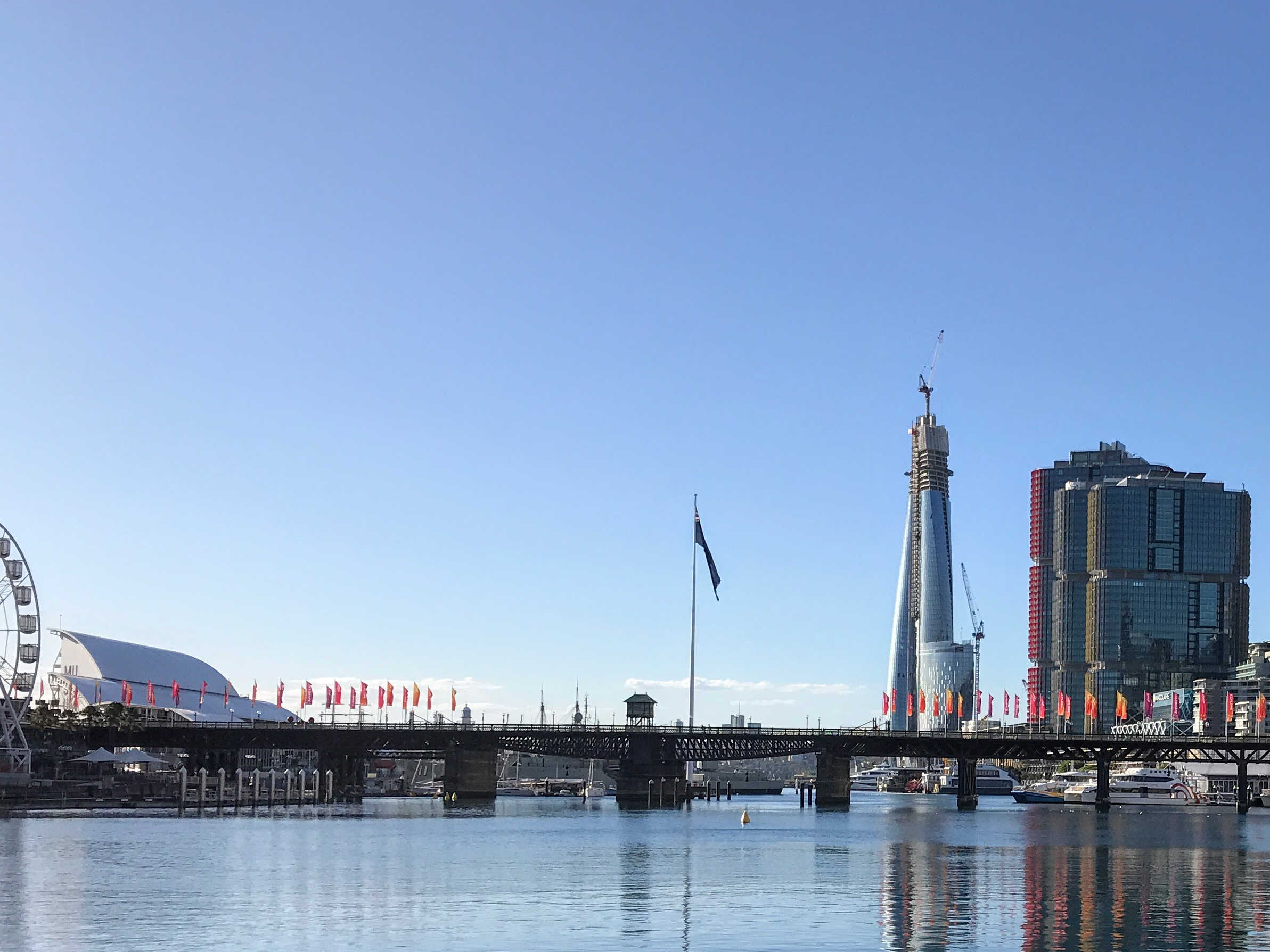
So when I went into the city today to buy some electronics which weren’t going to be delivered for 2-3 weeks, I rode my bike instead. It was pretty bizarre to be in the city late on Friday afternoon, when the bars and pubs are normally full of people winding down for the weekend. Instead, it was more like mid afternoon on a Sunday, except that Darling Harbour was also absolutely empty. It was quite eerie to see the playground with no-one in it – especially as it is currently school holidays. Last year on the same day there would have been hundreds of children there.
The most people I saw were the construction workers at Barangaroo, including one with a special HiViz vest labelled Covid19 monitor – presumably monitoring the social distancing.
Bit of Beauty
You can’t see the emptiness of Darling Harbour in this picture, but you can see what a beautiful day it was.
It is eerrie when the places you know, usually buzzing with people
are empty, same here. The blue skies and no pollution, there is sometimes a silver
lining. Love Marta
Slightly off topic, but it would be interesting to see the infection rate as a proportion of active cases rather than total cases. The log charts we see are deceptive in that the flattening occurs provided we don’t see exponential growth, which of course cant be sustained indefinitely. If we saw new cases as a proportion of active cases it would be an estimate of the effective transmission rate, which is a more relevant indicator of the our progress in getting this under control. Now of course I’m making all this up, and maybe it’s flawed for some reason, but interesting nonetheless.