
What factors seem to lead to higher or lower vaccination rates in NSW? I’ve adjusted the NSW location vaccination rates for the age mix of each location. The strongest correlation is with income levels – the higher the income, the more likely the population is to have had at least one dose of vaccine. Surprisingly, the percentage of the population who speaks a language other than English doesn’t seem to make much difference.
In NSW right now, the government is strongly encouraging us all to get vaccinated. I received my second Astra Zeneca dose this week, so I thought it might be time for a deep dive into what I can find out about the vaccination data. Since I wrote this passionate plea for data, the federal government has slowly been releasing more. This week they released vaccination rates by Statistical Area (SSA) up to 1 August. SSA is an ABS statistical measure – in country areas, there are generally around 100,000 people per statistical area, and in cities, up to 500,000.
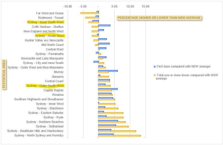
Superficially, the data appears to show that Sydney’s South West has the lowest vaccination rates in the state (here’s an ABC news story). But it also has a predominance of young people. So that is what you would expect to happen, as vaccination rates across the country are much higher in the over 70s. So I’ve corrected the NSW rates for age distribution, and shown how each region compares with what you would expect if you had NSW average rates of vaccination by age. I’ve highlighted the three statistical areas which include the 8 local government areas that are worst hit by Covid19 in Sydney – Inner South West, South West and Outer South West.
But the power of having this data is that it enables you to have a look at what might be driving the differential vaccination rates. So I’ve had a look at a few different factors to see what correlates highest.
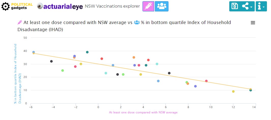
Index of Household disadvantage – the ABS has developed an index of household disadvantage. It provides a summary measure of relative socio-economic advantage and disadvantage for households, based on the characteristics of dwellings and the people living within them. There is a massively strong correlation between that index, and relative vaccination rates across NSW. For the statistically minded, the correlation is over 80%.
In a collaboration with Political gadgets, we’ve graphed a lot of different factors in the link below, to tease out what aspect of Household disadvantage might have the most impact. Average income is the strongest correlation of all the ones we’ve looked at.
I wasn’t surprised to see that, but it doesn’t necessarily help to inform policy. So I had a look at a few individual variables, and calculated the correlation with the total population who have received at least one dose of vaccine:
- Average income – 75%
- % of population degree qualified – 62%
- % of population with less than year 9 education – 74%
- % population speaking english as a second language – 14%
- % of population who speaks english not well or not at all – 2%
- % moved in the last 12 months 11%
- % one family household 38%
- % indigenous 60%
You can play around with the correlations in the graph here. Clearly there are a number of these factors which interact (eg level of education and income), so ideally a two way (or more analysis) would give a bit more insight.
The big insight for me from this is that English language skills made very little difference. Average income had the highest overall correlation (75%) closely followed by the percentage of the population with less than year 9 population. So income and education levels are the biggest drivers of vaccination outcomes in NSW. What does that mean for policy? It suggests that NSW Health is doing a better job than people think at reaching out to those with poor English, or English as a second language. But those with lower incomes, or lower education levels, are not getting the same care and attention, or if they are, it isn’t working.
The education one, particularly, is not a surprise to me. I’m super educated, and digitally savvy, and I’ve found the process of going and finding a vaccine appointment incredibly frustrating. It is not easy, and the less well educated you are, the harder it is likely to be to navigate the process.
This article in Actuaries Digital talks about the research on vaccine rollout and interventions that work.
Commentators routinely assume ‘vaccine hesitancy’ is the cause, but there are many other factors at play. The US-based Community Guide and the globally recognised Cochrane Network have both undertaken systematic reviews of interventions to increase vaccine uptake. They include:
- making vaccines free and services convenient;
- reminders when a vaccine is due;
- default appointments;
- performance monitoring and feedback;
- on-site vaccination; and,
- standing orders, incentives and requirements.
I hope that those inside the vaccine rollout are using a much granular level of data and this kind of research to review what is happening in the rollout, and what is working and what is not. This level of really granular information must be available somewhere within the government (at least for all those who have a medicare card). But the wider the distribution, the more the army of “data nerds” who have been keeping up to date with all things Covid in Australia can help.
Links
A few weeks ago I posted about Taiwan, hoping that their success in squashing a Covid outbreak would be replicated here in NSW. They haven’t quite got back to zero cases yet, but they are around 10 cases a day most of whom are in isolation throughout their infectious period. They are on what they describe as Level 2 alert (not a lockdown, but quite strict rules about mask wearing and number of people in the same space), which has been extended until August 23.
The Doherty Institute has released the modelling that was used to inform the National Cabinet’s latest roadmap for reopening at various stages of vaccine rollout. Definitely worth a read, but some quick extracts:
Models of COVID-19 infection and vaccination were used to define a target level of vaccine coverage for transition to Phase B of the National Plan. The model was based on the simplifying assumption of a single national epidemic, with COVID-19 transmission, severity and vaccine effectiveness as for the Delta variant. Vaccine allocation scenarios were defined towards threshold coverage targets (16+ years) of 50/60/70/80%, noting achieved coverage to date has been largely concentrated in high-risk groups and elder populations in line with existing strategy…
…Stated objectives of the immunisation program enabling the transition to Phase B are to constrain severe outcomes within clinical capacity and reduce the intensity and length of requirement for socially and economically impactful public health and social measures. For ‘baseline’ levels of social and behavioural restrictions, rapid epidemic growth is expected at 50 and 60% coverage, with more substantial transmission reduction by 70 and 80% targets. In these scenarios reduced effectiveness of the public health ‘test, trace, isolate, quarantine’ (TTIQ) response is anticipated due to high caseloads;
An analysis of the likely full death toll of Covid19 in India from the Center for Global development suggests it has been 3.4 million – 4.5 million people up to the end of June, compared with the official toll of around 400,000.
But all estimates suggest that the death toll from the pandemic is likely to be an order of magnitude greater than the official count of 400,000; they also suggest that the first wave was more lethal than is believed. Understanding and engaging with the data-based estimates is necessary because in this horrific tragedy the counting—and the attendant accountability—will count for now but also the future.
Life Glimpses
I was amused at myself this week when I succumbed to reality and put my good shoes away in the cupboard, it’s going to be a long time before I need shoes for anything other exercise. But the plus side of settling in for the long haul of lockdown is that I had my first zoom cocktail party this week – there were some quite good looking cocktails being made at home around Greater Sydney. Sadly the problem with a virtual cocktail party is you can’t taste anyone else’s, so my friends’ martinis could only be admired over the screen.
My family has decided that notwithstanding the rules, it is probably best if none of us cross the Harbour (it is about 5km from our house), so I’ve been doing a bit more exploration on my bike in my own neighbourhood. I always love Bradley’s Head, but I also went to Balmoral this week, to see a group of police, theoretically monitoring compliance, but largely chatting amongst themselves rather than looking closely at the (very big and possibly not entirely socially distanced) queues at the takeaway cafés.
Bit of Beauty
Today’s bit of beauty is from a few weeks ago, my regular cycle to Bradley’s Head – on a clear day, the sunset is always beautiful.

Thanks for your updates Jennifer, I really appreciate getting information I feel I can trust.
Bit of a data nerd myself being an accountant, but unfortunately statistics was never a strong point.
Totally agree with your hopes re granularity of data as the devil is always in the detail.
To be honest I’m mystified by the lack of vaccine promotion. I think I saw one ad while watching the Olympics (vs half a dozen saying “Stay the fuck away from Victoria”). Maybe they simply don’t have the vaccines to meet any increase in demand — in which case any method to try and increase uptake is pointless I suppose — but it seems a cheap and obvious thing to try. Personally, I’d be flooding the airways, newspapers and web.
I agree, I really haven’t seen much promotion (compared with the ads that flood all my devices every time I so much as glance at an online shopping site…), where is the heartwarming ad from all the out of work actors from the plays I’ve just had cancelled on me?
Looks like those geographic vaccination rates are being published weekly, accessible via https://www.health.gov.au/resources?search_api_views_fulltext=geographic&f%5B0%5D=field_audience%3A451&f%5B1%5D=field_date_updated%3A2021
Thanks Gary, I was hoping that would happen, but hadn’t seen that yet. I’ll try and update the numbers in the next day or so.
Another terrific piece, Jennifer!
My understanding is that socio-economic status and level of education play a part in the willingness or intention to get vaccinated. See this from last year, for example: https://www.thelancet.com/journals/laninf/article/PIIS1473-3099(20)30724-6/fulltext#coronavirus-linkback-header
It seems likely, too, that a lower income would correlate with a real cost of getting vaccinated (no paid time off), so incentives make sense to me, whether that’s by way of carrots (e.g. $300) or sticks (can’t work without it). Mind you, that’s not a scientific evidence-based opinion!