
Vaccination take-up rates are based on population estimates. For Australia as a whole, the ABS’s estimates of population are probably quite accurate. But the more localised the analysis, the greater the approximations required. Inaccuracies in population estimates are more likely in areas with large transient populations, particularly those who do not have citizenship or permanent residency. It’s probably not a coincidence that the Melbourne City Council area has the highest transient population and the lowest first dose vaccination rate in the whole of NSW and Victoria.
I’m really pleased that despite all the early fears, when vaccines are available, Australians get vaccinated. In the NSW population aged over 12 (the only ones who can get a vaccine), 92% had had a first dose by 21 October 2021, which is quite promising for all of the eligible population of Australia ultimately getting to the high 90%s vaccinated.
But the lower down you go into the locations, some surprising areas are lagging behind. The Cities of Melbourne and Sydney have two of the lowest rates of vaccination of all local government areas in NSW and Victoria – with only 74% of the over 15s having had a first dose, despite huge availability. Other large inner city areas with low vaccination rates include Yarra, Port Philip, North Sydney, and Waverley. Those are all areas with quite high transient populations. And it is likely that those are places where the population estimates might also be the least accurate.
 So where do the population estimates come from? All population estimates used in vaccination statistics are based on the latest release of population breakdowns by region – as at June 2020. The population estimate at March 2021 is only marginally higher, so even though June 2020 is more than a year ago, June 2020 is a good starting point.
To get to the population estimates for each area:
- First of all, the ABS looks at a national level. They build an estimate based on the total population calculated at the Census, in August 2016, and then move the estimate forward with births, deaths, and net migration.
- This movement is allocated by State (and territory), based on individual records (for births and deaths) and then mostly individual records for arrivals and departures. For arrivals and departures, in the last 18 months, this calculation has been quite complex, as arrivals and departures only count for migration if they are for more than 12 months. Recent passenger movements are assumed to have the same pattern of permanency as previous ones (based on travellers from a year earlier, with similar characteristics, such as age, citizenship and visa status).
- Then the ABS looks at migration between states, largely using medicare and electoral enrolment data. And then finally, at a local level, the ABS builds a model to allocate the overall population change down to local areas based on the movements between the last two censuses for each local area, based on available statistics (which vary by area, but the major ones used are):
-
- Dwelling approvals – how many new dwellings have been built since the last census, with a lag for how long it takes for them to be built and people to move in
- Medicare enrolments – changes in address for medicare
- Electoral enrolments – changes of address for the electoral roll.
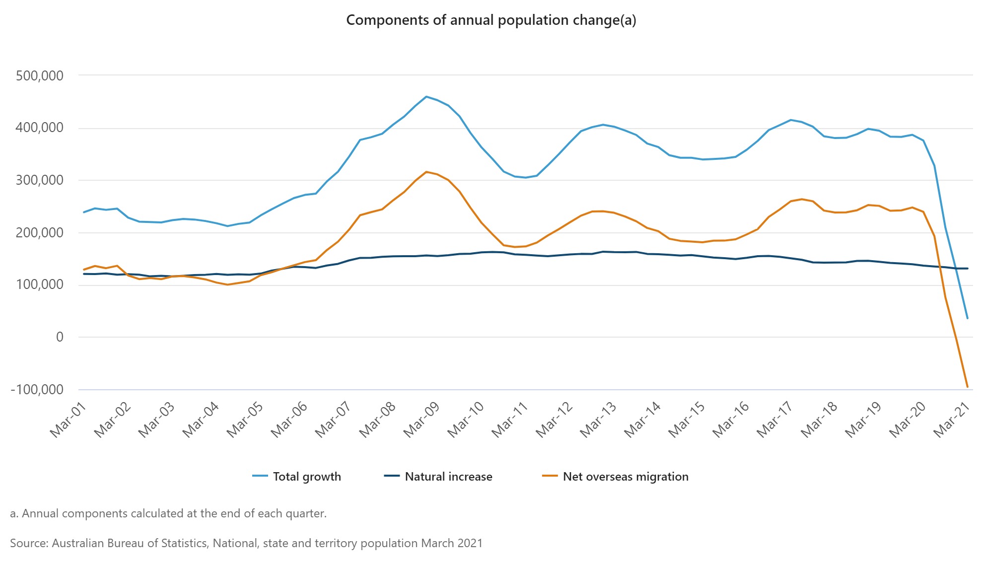
In this eighteen month period of big changes in migration for Australia – the graph above shows the dramatic changes – the accuracy of all these estimation methods will be under pressure.
The major inaccuracies are likely to be
- At a national level – the estimate of total migration is still quite approximate given it isn’t clear who is permanently arriving and departing, and the pattern of who is leaving and arriving for more than 12 months is significantly different from two years ago.
- At a state level – movements between states are based on the accuracy of medicare and electoral roll changes since the 2016 census – the longer this goes the more inaccurate it becomes
- At a local level – allocation of state level movements down to local areas is likely to be most inaccurate for those who are not in the medicare system or on the electoral roll – those who are not permanent residents.
So let’s look at an overseas student, living in Central Melbourne, who came to Australia to start first year university in 2019.
- They leave in December 2019 to go home for the summer to their own country – let’s say China.
- Most university courses started in February 2020, so they were stuck in China before university started, and are still there, learning remotely.
- When they left, they weren’t enrolled in medicare, as their visa didn’t allow it.
They probably wouldn’t have counted as an overseas migration until they had gone for 12 months – as people of their citizenship and visa status would be expected to come back after university holidays. The statistics show this, with estimates of overseas departures for that period changing dramatically with every new quarter of information. When allocating the change in population movements to individual States, our university student would probably be correctly allocated to Victoria, as their initial arrival card would have them arriving in Melbourne.
But in allocating the change in population movement to local area in Victoria, the allocation would be based on number of dwellings in the City of Melbourne, and movements in medicare and electoral enrolments. Our university student would probably have left an empty apartment or university dormitory behind, and would not be captured in the medicare records, as their visa would not allow them to enrol in medicare. So their departure would probably be allocated to somewhere else in the Melbourne suburbs – where someone their age taking a gap year, or studying overseas might have left from – in previous years.
![]()
This graph shows the local government areas in NSW and Victoria with the most transient populations (as measured by the 2016 census). They also have some of the lowest first vaccination rates of all local government areas.
This may not quite be the full story. Those not enrolled in medicare also don’t have as many vaccination options available to them. While vaccination is free, they can largely only attend large vaccination clinics, rather than pharmacies or GPs. And once they have their vaccination, many also struggle to get a vaccination certificate (which probably means they won’t be in the statistics).
What would I be taking from this if I was running a vaccination program? Areas with transient populations are likely to have inaccurate population estimates. But they are also likely to have more people who have difficulty being vaccinated. Measures of vaccination rates in larger geographic areas are more likely to be accurate. And those on temporary visas without medicare are probably the hardest to reach, and should be particularly targeted as vaccination levels get closer to 100%.
And one final point. If, like me, you’ve been watching vaccination rates closely, you might have noticed that the ACT appears to have vaccinated more than 100% of its over 50s population. I don’t have a good theory for why this is – my best guess is that the inter state migration statistics for the last five years have understated the real population of the ACT (particularly likely given Queanbeyan in NSW is almost a suburb of Canberra).
Links
After a friend asked me about pregnancy and Covid19 vaccines, I went looking for links. This is the best one I found, reinforcing my general impression that pregnancy worsens the risks of Covid19 significantly for both mother and baby, and that the vaccines don’t seem to be any riskier whether you are pregnant or not.
Medical decisions around pregnancy are hard, and the urge to protect the pregnancy by just leaving it alone is a strong one. It can feel like the small risks associated with vaccination are avoidable – so why take the chance? The problem, of course, is that the virus does not allow you to choose. Opting not to vaccinate is, unfortunately, a choice to roll the dice with a virus that has killed millions and has led to catastrophic outcomes for both mother and child.
The Financial Times has a survey of data problems around the world, which have affected Covid responses, including estimating the population to understand vaccine coverage
“The average person would be surprised that governments don’t know how many people are actually in the country,” said Stian Westlake, chief executive of the UK’s Royal Statistical Society. “But this great unknown can cause a whole host of data glitches, especially when responding to a health emergency.”
Life Glimpses
Since my last post, Sydney has opened up substantially. Those fully vaccinated can go more than 5k from home, sit down in a café or restaurant, or someone’s house, or even drink in a bar.
While I didn’t think the lockdown was stopping me from doing all that much, I’ve done something new almost every day since then, including bushwalking in the Blue Mountains (more than 100km from home!), meeting my choir for an outdoor singing session, going to several cafes and restaurants, having family over to lunch, and riding my bike outside my 5km area.
Meeting people in person again has been lovely, and I was really looking forward to it. I hadn’t realised just how much I was also looking forward to leaving my 5km radius, until I actually did it. New places have been quite exciting.
Bit of beauty
Photo credit to geekinsydney for this one – on our bushwalk in the Blue Mountains, the flannel flowers were out in abundance.
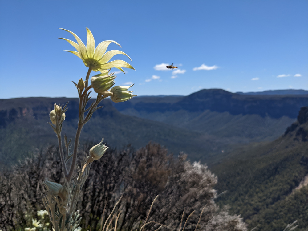
A Flannel Flower – Thank you.
Marta
Interest contrast with NZ. They’re opening up based on 90% uptake across all their District Health Boards, with the ‘population’ based on interacting with the Health Service. They highlight the issues in the “HSU Population” tab of their data but counting individuals, rather than estimating totals, will give them the opportunity to reach out to the holdouts
https://www.health.govt.nz/our-work/diseases-and-conditions/covid-19-novel-coronavirus/covid-19-data-and-statistics/covid-19-vaccine-data#download
Very interesting thanks Gary, in the UK the equivalent data set (people in contact with the health system) seems to have overstated the population, particularly at peak working ages, as they left the country, but didn’t tell the health service. I notice they’ve got a whole section on data issues in their spreadsheet, so they are aware of the problem, but it’ll be tricky if they don’t quite get to their 90% target and data could be to blame.
The ACT is now at almost 99% first dose for those aged 16+ (340,209 / 344,037). And over 97% for those aged 12-15 (19,163 / 19,693). So, there surely must be under-estimation of the denominator there. And it could be by quite a large margin, couldn’t it?
This has potentially serious public policy consequences, since the ACT has trumpeted the fact that its high vaccination rates have been achieved without discriminating between the vaccinated and unvaccinated in its roadmap to reopening. (See here: https://www.theguardian.com/australia-news/2021/oct/27/australian-business-groups-lament-nightmare-of-states-differing-covid-vaccine-mandates).
Interesting point Richard, although the LGAs next to the ACT are also very high, so my Queanbeyan theory might not be right. When you look at the NSW map, the central Sydney LGAs are by far the worst. They must have all gone to Canberra!