
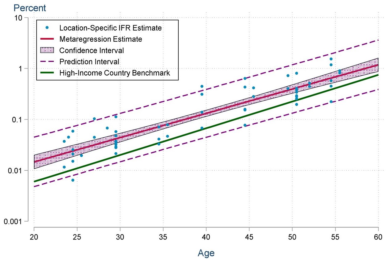
Death rates from Covid19 in low income countries have been around double the death rates for the same age in high-income countries. This is not easy to see from headline news for two reasons – low income countries tend to have younger populations, so the population level death rates are lower, and low income countries also have much poorer statistical reporting, making it hard to tease out actual death rates.
This analysis has been out for a month or so now, but it is still shocking. The authors do a metanalysis of death rates from Covid19 around the world and conclude that
Seroprevalence in many developing country locations was markedly higher than in high-income countries but still far short of herd immunity. In most locations, seroprevalence among older adults was similar to that of younger age-groups. Age-specific IFRs were 1.3-2.5x higher than in high-income countries.
The burden of COVID-19 is far higher in developing countries than in high-income countries, reflecting a combination of elevated transmission to middle-aged and older adults as well as limited access to adequate healthcare. These results underscore the critical need to accelerate the provision of vaccine doses to vulnerable populations in developing countries.
The graph below shows this picture – the green line is the infection fatality rate by age in high income countries, and each blue dot is an estimate from the low income countries, with the central shaded area showing the confidence interval for the infection fatality rate in low income countries. The authors note that many countries have inaccurate and delayed mortality reporting, so this outcome may well not be showing up in official statistics.
With the emergence of the Omicron variant reminding everyone that what happens in low income countries affects the whole world, this study also reminds us that vaccinating lower income countries also alleviates suffering directly. The suffering from Covid19 is higher in lower income countries than high income countries.
Links
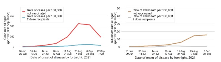
This month NSW Health released a study of the hospitalisation and death rates in our latest outbreak, by vaccination status. While it is not news that the vaccines available here in Australia (Astra Zeneca and Pfizer, mostly) are very effective, it is good to see some local statistics confirming that.
In the peak fortnight of the outbreak to date (25 August to 7 September), the COVID-19 case rate among 2-dose vaccinated people was 49.5 per 100,000 while in unvaccinated people it was 561 per 100,000, a more than 10-fold difference. The rates of COVID-19 ICU admissions or deaths peaked in the fortnight 8 September to 21 September at 0.9 per 100,000 in 2-dose vaccinated people compared to 15.6 per 100,000 in unvaccinated people, a greater than 16-fold difference.
My favourite graph is this one, showing that both the rate of cases, and the rate of ICU admission or deaths are enormously different over the NSW outbreak peak (late August early September).
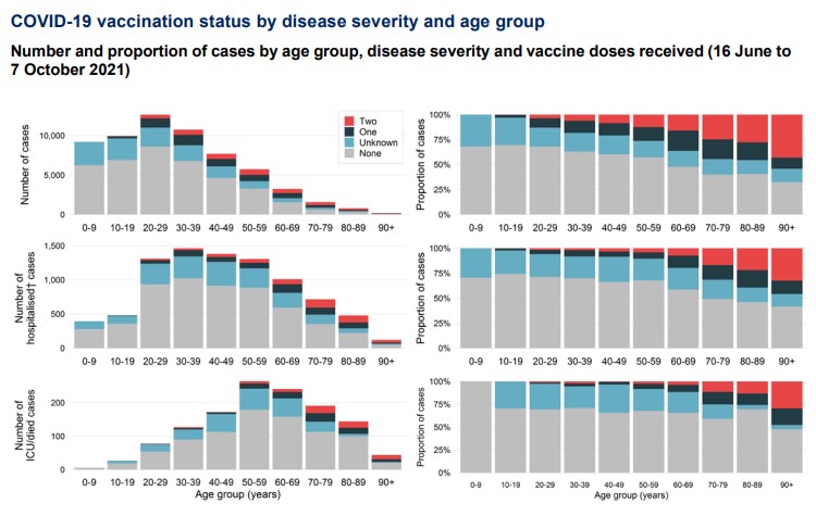
But we do have to be careful when looking at a total, given that the vaccination status of the NSW population was quite different by age during the peak period – those aged over 70 had had much more chance to get vaccinated before the Delta wave hit NSW. The graphs below show that, as you would expect, there are more fully vaccinated cases in the older age groups, because there were more fully vaccinated people in the older age groups to start with. But the difference between the top graph – proportion of cases, and the bottom graph – proportion of cases in hospital and ICU shows the effectiveness of the vaccine visually.
Life Glimpses
On November 1, fully vaccinated people who lived in Greater Sydney were allowed to go outside Greater Sydney. So we did! Geekinsydney and I had a week away, dropping our university student off in Canberra before spending the rest of the week at a beach on the South Coast. The weather was pretty ordinary, and we both had work to do and meetings to go to, but it was so nice to be in a different part of the world for a change, even if we spent most of it indoors.
Bit of beauty
This lovely flower (lotus?) comes from walking by the lake in Canberra, where we found a park we hadn’t been to before.

I do love graphs and stats ! 😷.
And yes, definitely a very beautiful lotus bud and flower.
That first graph is even more depressing when you realise its a log scale….
Thank you Jennifer:
The stats and graphs give me a much better appreciation of the value of the vaccinations. far better than TV screen that gives only a short glimpse to study. Well done!
See you soon.
Hi,
Glad to learn that you changed your surroundings for a while. Here we are experiencing the new variant. New regulations for the time being, for people coming from overseas. The flower is beautiful how nice to find a new park.
Love